Conversant Design System
RESULTS
60
Components
35
Applications
200%
Increase in app logins
2000
Automated Tests
THE SITUATION
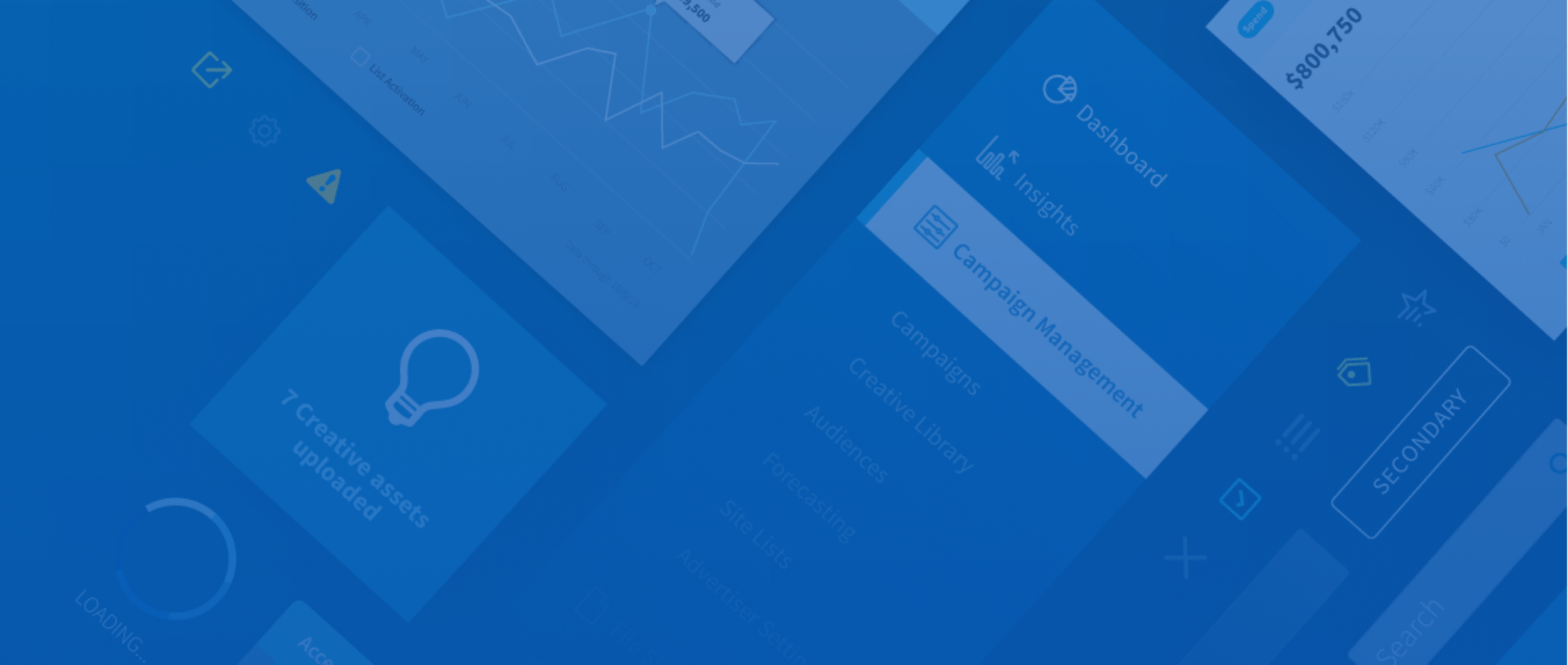
Conversant is a global adtech company. They offer a platform that allows for targeting and optimizing digital marketing campaigns. The company had vast amounts of data displayed across numerous applications and plugins. There were 100s of hours of duplicated effort and maintenance due to development teams recreating components per app.
OBJECTIVE
Organize this data and standardize the user experience. And be flexible enough to accomodate future apps.
My Role
UI
Screens which users find delightful and easy-to-use.
Visual Design
Finely crafted visuals that feel inevitable.
Interactions
Fluid motion so the interface never feels static.
Documentation
Documenting design guidelines and patterns to ensure consistency and effective solutions.
Process

SYSTEMS THINKING
Reuse
Combine
Modify/Enhance
New Component
Efficiency
The primary goal for any design system should be efficiency. Can users complete their goal with as little friction as possible. Maximizing efficiency saves time and allows more to be accomplished in that time. Efficiency directly contributes to business goals and revenue.
Inputs
Input fields are one of the most widely used components across the system. Easily completing forms is essential to creating a new campaign or line item. I updated the size, style and interactions for input field components.

OLD

element.style {}
<style> .is-ready.Clr-InputField-input {
transition-duration: .2s;
transition-property: border-color,background-color;
transition-timing-function: cubic-bezier(.4,0,.2,1);
}Size increased size to 36px: For ease of focusing and entering information
Focus state interactions: Clear which field is active in a long form
Visual indicator: Bottom border appears, meets 2.0 accessibility
Visual updates to match brand: Adds sense of delight during tedious tasks
COMPETITIVE ANALYSIS
I researched inputs from several other leading design systems to understand the landscape and possibilities. Some trends that I found: taller input height, floating labels, background colors, border vs. no border

DESIGN CONSIDERATIONS
Increase size, but not drastic. Product managers concerned about adding too much extra space to pages.
Keep a box style: Box style inputs still a best practice perform better in user testing.
Don’t float labels: Ensure good accessibility
Input States
I then designed out all states for all input variations, including text, search, text area and selects. I was careful to work closely with the development team to test out interactions and ensure all component states were accounted for.


Form Grouping
PROBLEM
Many applications feature long forms, with many different types of inputs and expanding sections. These screens lacked proper hierarchy.
SOLUTION
I solved this problem by grouping related sections with the form, and also applying proper spacing.
ALTERNATE SOLUTIONS
I explored other solutions as part of the process: progressive disclosure, dividers and card approach.


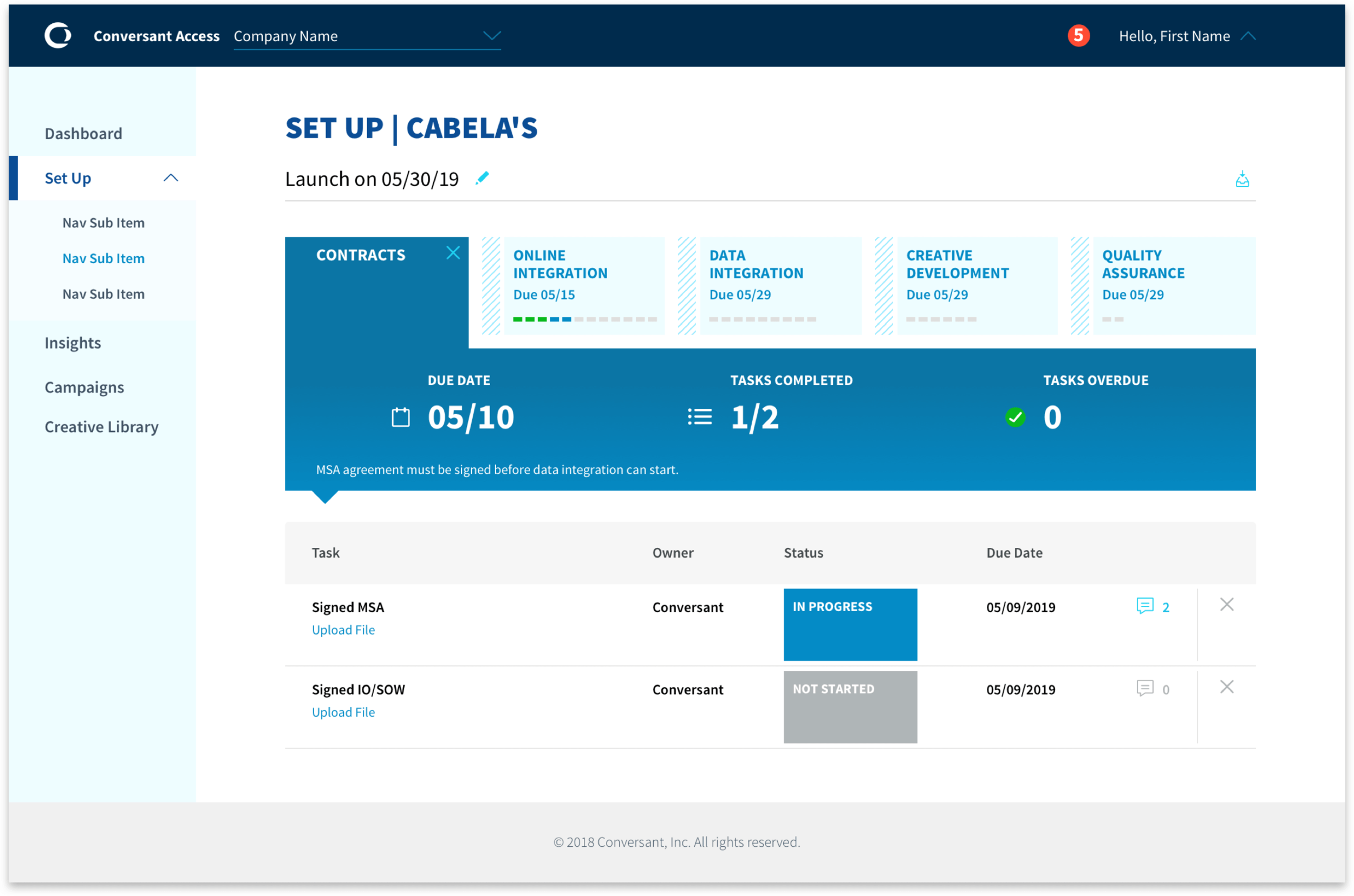
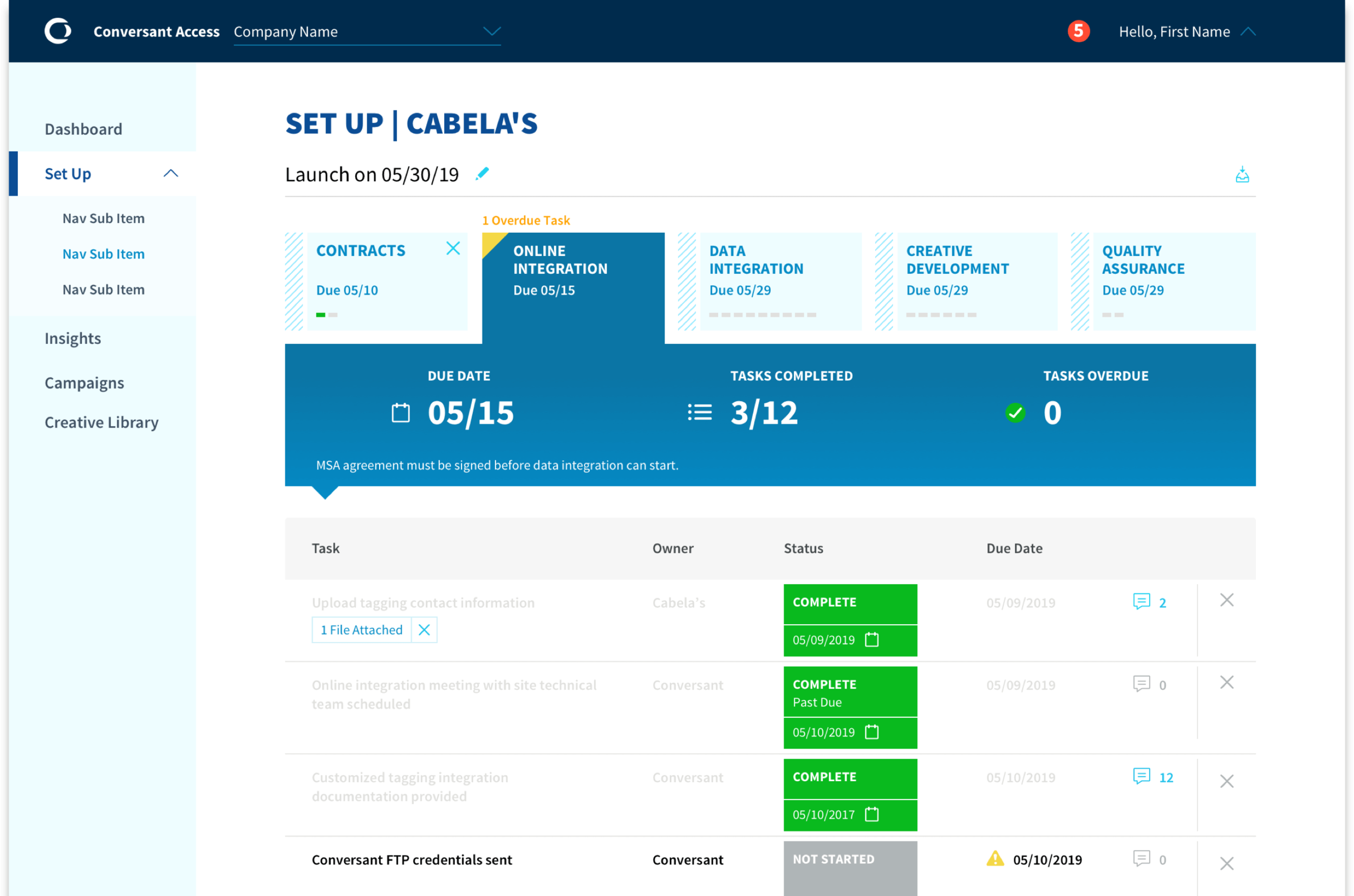
Tables
I developed a solution for system table component: variable row padding. Product managers presented a contradicatory design challenge: want to see more rows per page with tighter spacing, while at the same time adding more complex features and content into the tables.


Onboarding Tool
UI, visual design, interactions for project management tool.
UX WIREFRAME
The provided wire featured a card-based approach for each step in the process, with a lot of busy info. Users were presented with all the details about all steps at the same time.
REIMAGINED UI SKETCH
I reimagined the UX, sketching a tab-based approach with visual indicators to represent project step status. Also a large summary area gives a clear area to focus on for details, letting users decide which steps they need to know more about.


Delight
Having a good experience and clear user flow is a must for any product. But users are always demanding more–they expect the product to look stunning and feel like the brand. Users want to feel good while accomplishing a task. Most important, having a visual personality makes users trust the product.
SVG Icons
I have design many custom icons, and followed use of an icon grid to maintain consistency. Exported as SVGs allows for most control over style and adding animation classes.

Icon Grid
Activity
Tip
Sites & App Lists
Promo
UI Illustration
At certain moments of the experience, a friendly visual metaphor can help explain more quickly and add an element of delight to the inteface.
Empty State

ALTERNATE

.Clr-Graphic-Message  {

/* This easing applies on the way IN */
  transition-timing-function: ease-out;

 /* This timing applies on the way IN */
transition: 0.4;}MORE EXPLORATIONS
No Data

MORE EXPLORATIONS
Status Badges
These badges are a visual way to communicate important statuses so that users can quickly identify the state of a given object. They are typically placed above an H1 or used inside a table column.
PROBLEM
Some statuses have lengthy messages attached. Also, there are more statuses than available system colors.
SOLUTION
Separate the component into 2 versions: one that is basic, one that allows for a message to appear to the right. Also, using an alternate border style expands color options.


Targeting Buttons
I designed hover and flip interactions for targeting buttons. I coded a prototype in CodePen that developers could reference for the final build. Hover and click below to try them out!
See the Pen And/Or Coin3 by Ryan (@ryan1wolfe) on CodePen.


RESULTS
A best-in-class user experience at every step of the journey
60
Components
35
Applications
200%
Increase in app logins
2000
Automated Tests

cui.conversantmedia.com
Visit the documentation site for the Conversant Design System and explore the entire system in detail.